To develop an engaging visual website that is intuitive to use, that ranks well and easy to maintain by site administrators.


Our Approach
We approach website design by considering this mantra – don’t make me think. We know that even though users spend less time on websites reading content, they are familiar with the way they work. So while we aspire to make the design fresh, basic functionalities should still feel and work as other sites, ensuring users focus on content and not on how to use the interface.
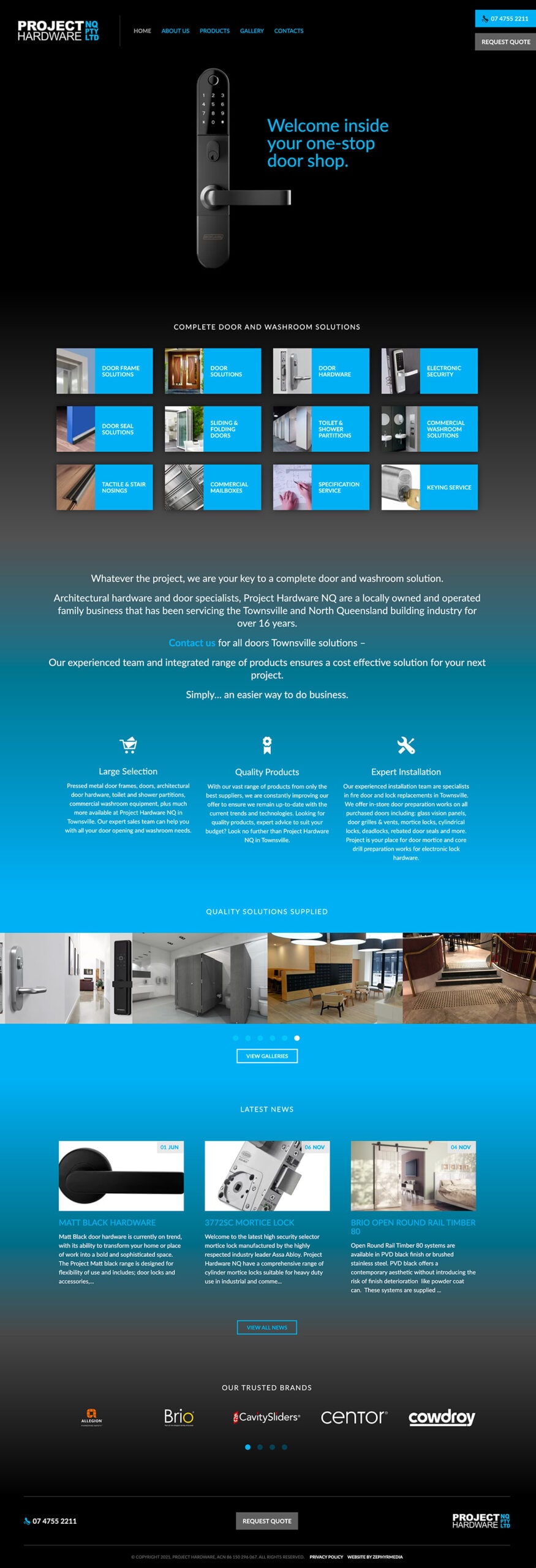
In this case, the website home page design uses a background gradient that subtly changes as you scroll down. This aims to give a visual indication of different content sections while also maintaining good contrast readability with a dark, dynamic scheme. We used the brand’s existing logo and colour palette throughout the site to ensure brand consistency. We used a lighter colour palette inside to ensure readability and to indication they are within the site as opposed to the home page.
The site is coded for speed with minification and asymmetric loading of scripts practices employed to give the site the best chance of high native search engine ranking.
View Project
Services Delivered
